
Context
This designer-led project aims to enhance the category navigation experience on foodpanda's shopping page. Currently, the page features a horizontal scrolling navigation, which limits visibility to just four categories at any given time, despite having a total of 40 categories.
Here’s what the users are saying about the current design:

This limitation has resulted in categories being 'hidden' from view, leading to a notable reduction in user engagement and interaction, especially in exploring deeper into the category list. Additionally, the current navigation setup poses challenges in terms of accessibility.
Our data indicates this design shortcoming, emphasising the critical need for a navigation overhaul to facilitate more comprehensive browsing and improve overall user experience.

As the category position on the page increases, we observe a corresponding decrease in the click-through rate (CTR).
Project Timeline
Here’s an overview of the project's timeline.

Goal & Hypothesis
Our goal is to refine the navigation experience on the category browsing page by enhancing the visibility of categories and subcategories. This will facilitate user exploration of our extensive product range. By introducing a more intuitive and user-friendly navigation system, we aim to simplify product discovery, fostering heightened user engagement, satisfaction, and increased sales.
We hypothesise that these enhancements will motivate users to delve deeper into our product assortment and discover items that meet their needs and interests.
As a result, we anticipate a positive impact on the average basket value (ABV) and conversion rate (CVR3), metrics that are pivotal to our business success.
Metric 1: Unique Category per Session Number of distinct categories visited per session | Metric 2: Category CVR Sessions that made a transaction after opening the category page | Metric 3: Average Basket Value ABV is the average amount spent by users in one transaction |
Guardrail Metric 1: Intent CVR Sessions that made a transaction out of all sessions |
Design Walkthrough
Here, I'll walk you through my design journey, explaining the thought process and key design decisions made along the way.
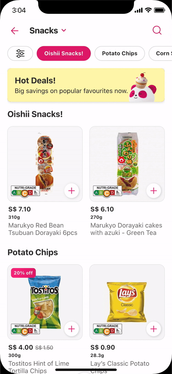
What changes have been made?

We've redesigned our category browsing interface, transitioning from the horizontal scrolling system to a dropdown menu that reveals a bottom sheet. This change allows users to view more categories at a glance and easily explore those that were previously hidden.
The bottom sheet
In my design exploration, we conducted several unmoderated tests, focusing on two distinct styles: a grid view on the left and a list view on the right.

With the grid view, users reported that images were helpful in making decisions, though some found the design confusing regarding clickable areas and felt the quantity of images was too much. On the other hand, the list view was favoured for its simplicity, with users finding it easier to locate specific categories.
Upon discussing these findings with my team, my PA thought, why not combine the best of both worlds? And that's what we did, we merged the list view with category images, combining simplicity with helpful visuals (You will see this in the later section).
In our tests, a recurring suggestion was alphabetically arranging categories. We hesitated initially, mindful of potential mismatches with the Shop Detail Page and uncertain benefits.
However, recognising its value in improving navigation for users seeking specific items, we're open to exploring this in future A/B testing, despite its rare use among competitors.
How does it work?

Upon clicking on the dropdown, users will be greeted by a bottom sheet that smoothly slides upward, revealing the list of categories. Each category text is paired with its respective image, delivering a visually-appealing and intuitive browsing experience.
As you can see, we've merged the list view with category images for an improved version of previous experiments. The categories are now split into two sections: the top features front-end promotional categories like 'New Arrivals' and 'Promotions & Highlights', followed by back-end categories that include specific item types.

How are users reacting to the new design?
Naturally, we conducted tests on the new design with users and actively sought their feedback.

While there was a concern raised about the potential need for an additional click, user feedback was predominantly positive. Many appreciated the reduced clutter, resulting in a visually cleaner interface that improved the browsing experience over the previous design.
The dropdown was lauded for its ease of navigation and more organised item categorisation. A key highlight, as noted by several users, was the elimination of extensive scrolling to find a specific category.
Quantitative Data
All participants were given a task to find the ‘Beverage’ category for both Control & Variant (New design)

Clearly, the Variant design delivered better results in terms of the percentage of participants completing the task. More notably, the substantial decrease in the percentage of participant mis-clicks, and the average time taken to complete the task.
Motion Design
Let's dive into my favourite topic: Motion Design!
In this project, integrating motion design has been a key strategy for educating users about new features and the changes implemented on the page.
Overlay Tooltip
How might we ensure users notice and understand the new dropdown feature in the category navigation during their first visit?
To address this, we plan to add a dismissible overlay component that captures users' attention. It will feature a 'Got it' button for users to click once they've understood the information. This overlay will only appear on the user's first visit to the category page following the new feature's launch.
Category Transition
How might we use motion design to subtly indicate the presence of the swipe gesture without overwhelming users with extra components?

The second issue revolves around the swiping feature that exists in our current navigation system. Right now, user can employ the swiping gesture to switch between category and I don't want to deprive our power users of this feature, but this affordance is lost since we've done away with the tab system
I pondered ways to use motion design for subtly suggesting the swipe gesture, aiming to avoid cluttering the page with extra elements or overwhelming animations that could detract from the shopping experience.
My chosen solution is somewhat subtle. When a user selects a category, the transition to the new category will mimic a swiping transition. This repeated motion, observed every time a category is changed, is designed to intuitively teach users about the swipe gesture, embedding it into their subconscious over time.
Swiping Gesture
Below is a GIF showcasing the swipe functionality on the category page

Future initiatives emerging from this strategic project
Now, I'd like to give you a glimpse into future projects and also share some early explorations.
Exposed Filters
The current performance of the sort and filter feature in Q-commerce shows no significant impact on the conversion rate (CVR3). Metrics such as mCVR3 and QC Average Basket Value (ABV) remained unchanged post-implementation. This lack of effect suggests that the sort and filter functionality may be either too inconspicuous or not user-friendly enough, leading to underutilisation by customers.
How might we redesign the Sort & Filter feature in our Q-commerce platform to make it more visible and user-friendly, thereby increasing its usage?

Third Level Categories
The impending DFI Project integration is set to introduce approximately 20,000 new SKUs into our app, significantly expanding the inventory by about 133 SKUs per subcategory.
This substantial increase poses a challenge to our current endless scrolling navigation structure, potentially leading to inefficiencies in product discovery. The expected surge in SKUs could hinder the user experience and may obstruct successful transactions by making navigation cumbersome and overwhelming.
How might we innovate our app's subcategory navigation to efficiently manage the influx of new SKUs, improve the user experience and ensure smooth product discovery?


Thank you for your time and attention in reading this 😊